Tag: Bear Web Design

Girls That Code Visit Bear Web Design!

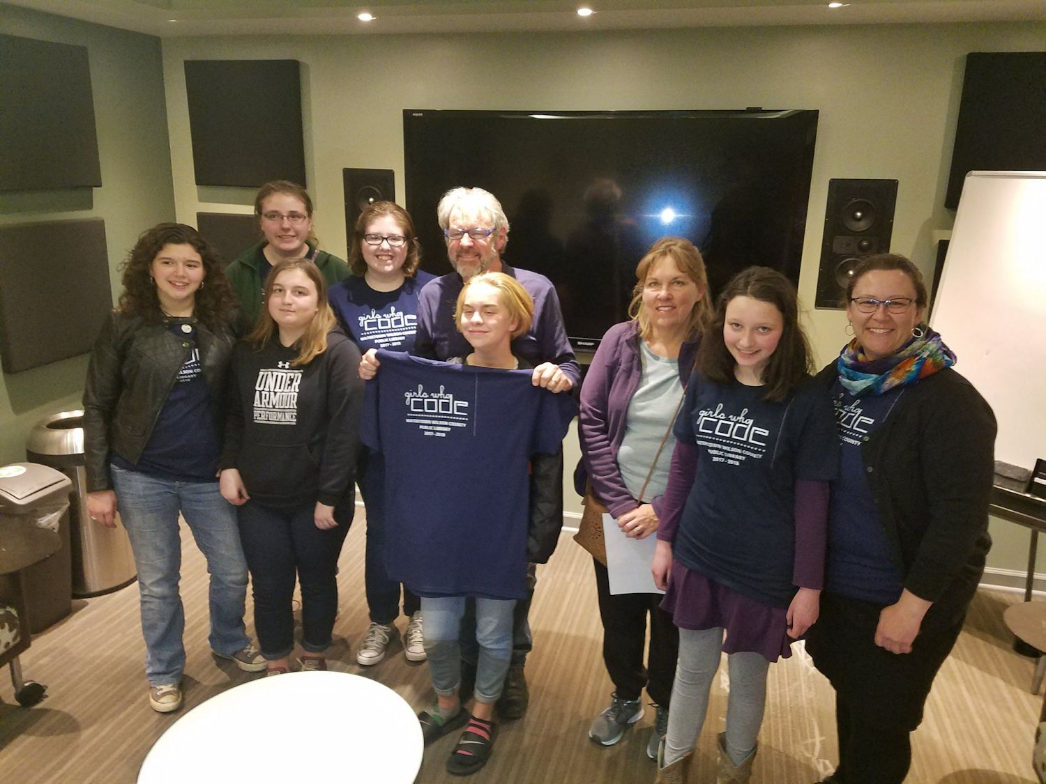
Girls that Code from Wilson County visited Bear Web Design in Nashville today to learn about the opportunities for programmers & developers in the 21st century! The girls are taught programming by web designer/developer Jennifer Folsom and were treated to pizza after their visit.

Continue reading

How Does Your Digital Profile Look?

Have you recently heard the term “Digital Profile”? it is becoming a key focus area for companies as well as individuals that provide services that are searched for on the internet. That means just about any company that operates today should be paying attention to their Digital Profile.

A Digital Profile as it sounds is a profile that has been establish online through your internet resources and usage.  Google is the best place I know of to check out your digital profile to get a feel for what people will see when they type your companies name.

Thanks to Google My Business (formerly Google+) we have really seen the development of the Digital Profile over the last 12-24 months. Google My Business includes Google Reviews, Google Maps & Directions, Google Search Results, hours of business, photos as well as links to your website. On mobile it is as powerful as it appears on a desktop and it can heavily influence whether a customer communicates with your company directly from google (e.g. calls you) or links to your website for further information.

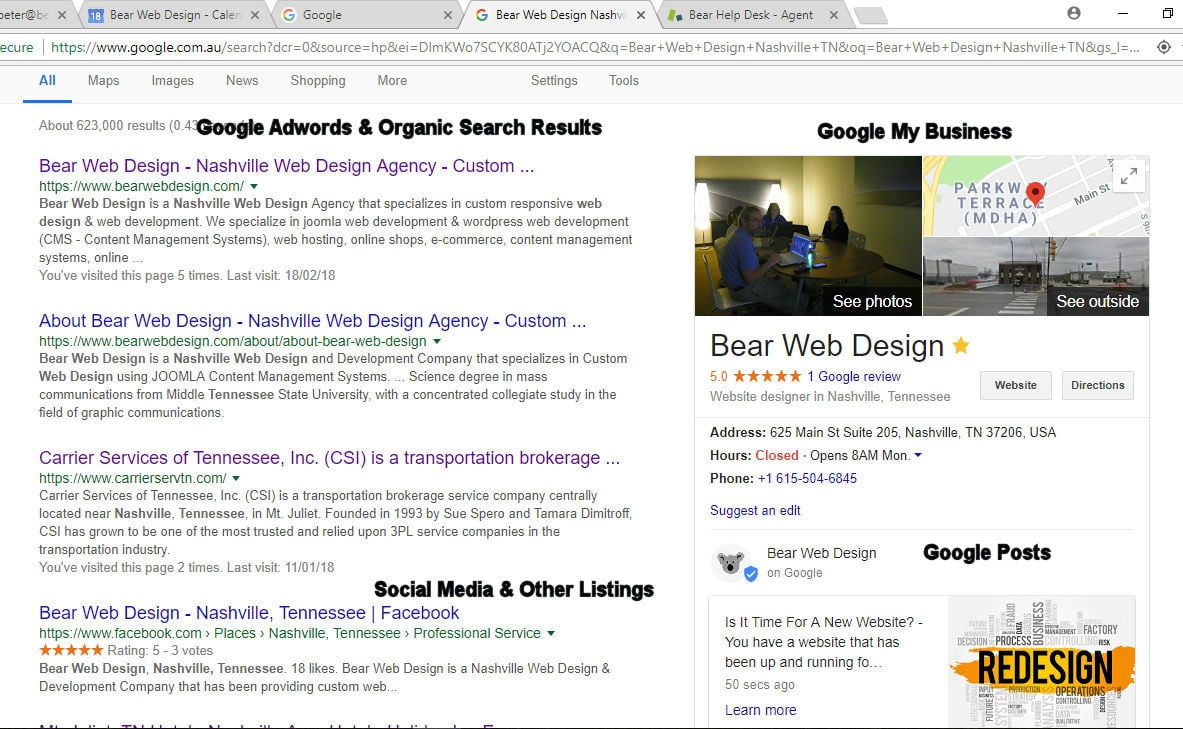
So using Bear Web Design’s Digital Profile as a starting example lets look at some of the basic elements… (see our Digital Profile above)…

  1. Google Ad Words and Organic Information sit on the left hand side of the search page result. Adwords are an online advertising services by Googler where advertisters pay to display ads that are tied to key search terms and phrases. Organic search results are website listings on search engine results pages that appear because of their relevance to the search terms.
  2. Google My Business sits on the right hand side and consists of photos, address & location, directions, website link, reviews, business hours (absolutely critical to being correct) and links for action – phone number to call, driving directions to come visit and website link to learn more about your business.
  3. Notice the Google Post that is under Google My Business (this is a new featured offered by Google allowing business owners to feed their content directly into their search results page! Google Posts will stay active for 7 days and I have seen some posts that receive 1000’s of views.
  1. Google Insights which shows you how many searches that your Google Digital Profile appears in including (Discovery) – those searching for your services or products but don’t know you directly and (Direct) – those that do search for you directly.

So if you haven’t checked out your Digital Profile it is definitely time to do so. It will be a critical part of your online success! And if you need some help managing and updating your digital profile please be sure to contact Bear Web Design!

Joomla World Conference opens a World of Opportunity

joomla-world-conference-in-vancouver-2016-blog.jpg

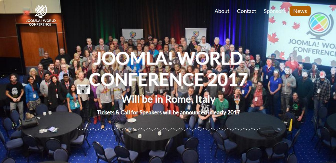
I am just flying back from the 2016 Joomla World Conference (flying from Vancouver to LA and then onto Melbourne Australia) so I figured with 16 hours of flying ahead this would be the perfect time to recap the conference I just attended and share with our clients and friends. It was the best conference I have attended to date with the leadership of Joomla being so much more focused on the end user experience than I have ever seen before. This is very good for our clients (and their web visitors) as the bottom line to any websites success is a great user experience.

Joomla is a content management system (CMS) and clearly one of the best in the world. Bear Web Design has been using this CMS for around 10 years now and we have attended 3 world conferences so far. And we do work with WordPress as well so we know there are other great CMS’s out there but there is no doubt that Joomla is evolving to become more than just a CMS that produces websites with plans such as connecting to apps in the future that will allow portions of your websites content to be shared with your your users thru these apps. It is truly a worldwide driven product (driven by the world community of Joomla).  And I am proud to say that the CMS that was the precursor to Joomla was called Mambo (and yes it was built in Melbourne Australia) so I thought it appropriate to give it a mention since I am flying there tonight!

People from Europe and North America are driving the product in my opinion but there are contributors from all over the world. It makes sense that great products on the worldwide web are a collaboration of people from all over the world.  Even when so much of the actual desired outcome of your websites demographic is usually local.

When I sit in front of a prospect and talk to them about how Bear Web Design can help them build a new website or redesign their current one I have such a level of confidence in the products we produce that I basically feel powerful. (not something you would think of with me if you know me). But the Joomla product is so solid and has such a proven track record that I am simply so confident in our ability to produce a great website at a fair market price that will greatly serve the client.  Combined that with great team that we have at Bear Web Design (that has custom designed more than 350 websites in the last 10 years) it is a pretty hard combination to beat.

At today’s keynote event the topic was the future of Joomla. That to me translates to the future of Bear Web Design and most importantly the future of our customers. Do they have a product that will serve them now and for years to come? Will it get better and will it continue to meet a very fast changing device market place? Well in today’s session I got a big YES! Most clients would know that we had a big security update around 4 or 5 weeks ago that was required to be updated to each client’s website asap to prevent a security flaw. We tell our clients when we update their website (geeky as it is it keeps them aware and knowing that we are watching out for them). But the bottom line is we (and Joomla) are on the ball when new updates coming out all the time! The version we upgraded to was Joomla 3.6.2. I know I know – doesn’t mean a whole lot to you but in the today’s keynote we got the future path of Joomla 3X to Joomla 4X (due for release in 2017) and then ultimately a Joomla X version is at the end of the tunnel possibly around 2018.  So why does this matter? The answer is clear!

Your website will need to be state of the art this year, next year and the year after to compete in your market place. And it is a competition (and the judge is Google and then the next judge is a visitor.) The reality with websites today is they are not built and then put in a hosting location and then 3 years later the process is repeated. (That era of web development is basically over). It is much more about a continuously updating the product and the website’s content while striving to offer more and more features to the user. Just like in the sales cycle I don’t spend that much time telling a prospect about Joomla and how well it serves us but the reality I know is that if our clients are happy with their website then are happy with Bear Web Design and ultimately they must be happy with Joomla! And you can rest assured that although so much of our business is focused locally the products that are driving those opportunities are from some of the best developers in the world collaborating all around the world to make sure that your website communicates effectively with your users.

It is that simple and in many ways, it is the human experience when it comes down to it and the neat thing is the user experience is Stockholm Sweden seems to have the same need as the user experience in Vancouver Canada and Melbourne Australia and you guessed it in Nashville, TN.  It is indeed a very cool time to be working with websites and I am eternally grateful to be able to serve my clients in such a dynamic and exciting industry. I look forward to continuing to help our clients improve their websites and users experience and ultimately improve their own success.!

Google Reviews – An Old Time Tradition In A Brave New Digital World!

Google Reviews Are Already A Tremendous Influence on Consumer Decisions

So I went to this great coffee house a few weekends ago in Franklin. Set in a historic house It had a gorgeous cottage garden area that surrounded the house that seemed as suitable for a glass of wine as a cup of coffee. When I walked by I could feel it pulling me in. The inside of the house was old but nicely laid out with lots of different and colorful rooms as one would expect in a house built in the 1890’s.  The very nice and modern coffee bar was located near the center of the house and I ordered  my favorite – a Cappuccino Grande and then found an amazing place to write my weekly blog – next to the grand piano on a small single table. I turned on my favorite music thru my head set ear phones and as I sipped on my delicious cappuccino and began to blog I thought to myself “Could it get any better than this – I LOVE THIS PLACE”…

Enticing hey?

Well what I have just done is shared a great experience I had with you. If you were in my family or a friend or associate you might have heard me raving about this place for weeks on end. What a great place… you must check it out… the coffee was great… and you know most of the time if someone tells you about something they like you really do consider it in future decision making.  In actual fact word of mouth information sharing is the most trusted source of consumer information we know of!

So how do we share our experience digitally?

There are many ways to share a great experience digitally thru many popular social medias. You can tell your facebook friends or tweet your followers but the reality is this form of sharing is real time. A day from now know one will go back looking at your old facebook posts or tweets regardless of how wonderful your experience was. So if you want to really clarify a great experience digitally that is going to be read by future potential consumers as well as family, friends and associates then you really have to consider Google Reviews!

I have read recently that online reviews may contribute to 10% of search engine rankings. (where Google Places you in a search result).

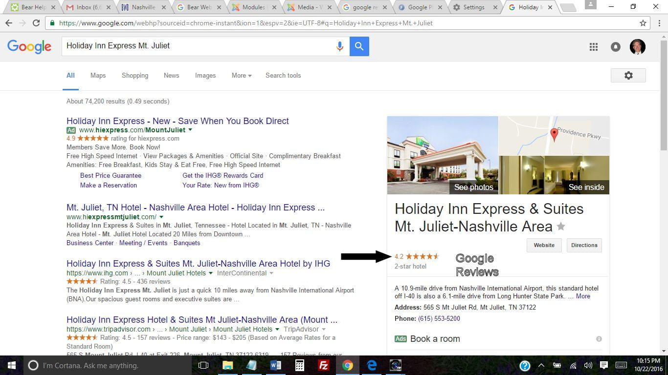
So you are looking for a hotel to stay at. You search for Hotels in Mt. Juliet and google returns 3 hotels (listed in Google Review Results order). Our customer and good friend Justin Patel’s Hi Express Mt. Juliet receives many great reviews (all the time). So you can see Hi Express Mt. Juliet is featured prominently in the search results with a link to immediately see the reviews… (HINT HINT – that is most likely what the searcher is going to check on before making a decision to book a room)…

Mt Juliet Hotel Results - Google Reviews

I have also read recently that it will take consumers 2-4 reviews to form an opinion – If I read 3-4 bad reviews generally I am gone BABY! So that stat certainly supports how I feel – and yes I look at reviews when making decisions online!

This Is Great! – Nothing But Great Google Reviews Right?

Getting a whole lot of great Google Reviews could really influence how much traffic your website gets (and maybe how many orders or bookings or prospects). Of course I have not told you the dark side of Google Reviews… the dissatisfied customer! Nothing will knock you over more than reading a bad review about your business.  In actual fact I will talk more about managing your Google Reviews in a future blog but the bottom line is you should actually respond to all reviews… thanks for the great review OR sorry you had a bad experience how can we help change that?  – it shows great personal touch and really shows you are connected to your online aspects of your business.

So the old time practice of sharing your experience with your friends and family certainly lives on with Google Reviews. The neat thing is if you genuinely have a high regard for a business you can share your experience online for others to read. And the good thing is you are fully in control of that review and can delete the review if you ever decided to. One other catch – you have to have a Google gmail account to leave a review which helps validate that the review is from a bonafide users and not an anonymous source.

So as part of getting you in the game I have provided a link to Bear Web Designs Google Reviews. It is embarrassing to say at this stage that we have never had a Google review but this is your opportunity to leave us a review and help Bear Web Design get on the scoreboard. (Of course only If you feel it is appropriate and please be authentic in your review). It is easy to do and will give you a larger voice in your digital world.  I have no doubt your company will receive reviews online in the future whether you solicit them or not. We have just started adding “Google Review” links to customer website to help to promote this critical aspect of Google’s Search Engine.

If you have any questions or need help in this area please be sure to contact me (615 504-6485).

Hope everyone has a great week!

Google My Business (My Goodness)…

bear-web-design-google-my-busines_20160917-215309_1.jpg

If you are reading this blog you must recognize that Google “Rules The Waves” just like Britannia did once.  Unlike when Britannia ruled the waves and everyone got it so many folks simply do not understand or comprehend the control and influence Google has over your business and many of your prospects. Google is all powerful and frankly all confusing. We (Bear Web Design) made a commitment to be Google Centric Company approximately 5 years ago and it has been a good decision for our business and our customers – but man if you don’t like people “Moving Your Cheese” Google probably is not going to be your thing.

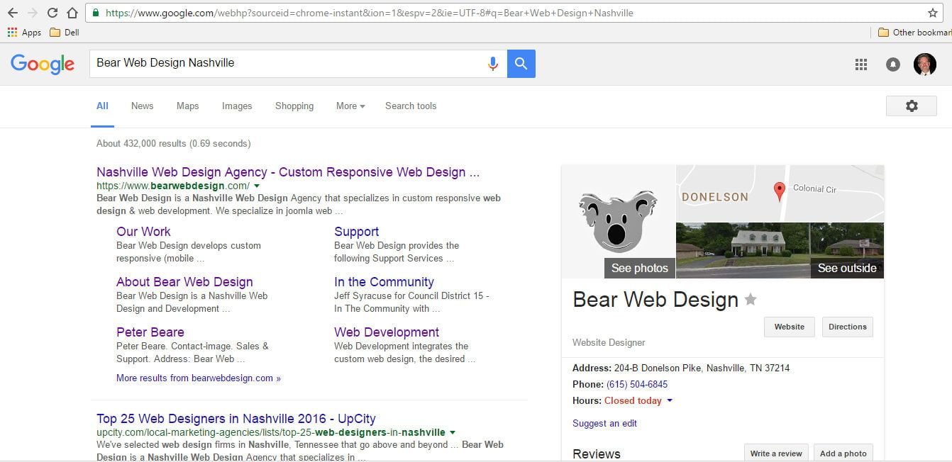
Most likely you don’t know what Google My Business is (My Goodness!) but you might have heard about Google Plus (Google+) and you have most likely seen it and used it before. If you go to Google and search for your company if you are reasonable shape your company will come up on the right hand side of the search (on a desktop) and it shows your physical location – called Outside (a street view of your business) and then business details taken from your Google Maps and your Google My Business Page (formerly Google Plus). If you have added photos to your Google My Business Page then these photos will be showing (if you have paid Google for a virtual tour then that should be available as well  – called Inside (my next blog friends!) – bottom line is that your business is represented on the right hand side of the search by Google My Business (and Google Maps)… Notice the cover photo to the blog – that is what I see when I search for Bear Web Design (in Nashville).

Are you still awake? (Remember your prospects come thru this method to find your website and consider doing business with you so WAKE UP – this is important!). On the left hand side of the search screen is the organic key title pages from your website that Google presents usually picking out your most important pages (most popular). Hopefully this search gives you a really good picture of what a customer or a prospect will see when they search for your company of google.  You can check this out on your mobile so you fully understand what all customers see.

In the event nothing comes up – HELP ME HELP ME HELP ME – you need some real help – if the left hand search organic information is there but your Google My Business and Google Maps is not showing up then Google probably doesn’t know where you are located… (and again you need some help!). Just to add to excitement of all this imagine someone is walking (or driving) and looking for local restaurants to stop in for a bite. If Google knows where you are then it will show them your restaurant as an option – if it doesn’t – TO BAD SO SAD!

So bottom line and cutting to the chase – Google My Business is about listing your business on Google and how it shows up for the local searcher (in particular). Google is location centric and it absolutely cares about what is in reach of it users (the searchers)… It actually wants to deliver the best possible result to the user so they continue to use Google (which ultimately supports the Google Ad-Words Advertisers and associated products).  The key is that YOU PROVIDE the necessary information to Google so it can do that. It is HORRIFYING how much incorrect information is on Google Maps and Google My Business right now. Hours of business is a classic I see wrong all the time. And the reality is it is not Google’s jobs to fix this (it’s yours) and you know who wins if you fix it (you do)…

This applies to mobiles as well – below are the two views (first page and second) on your mobile – just as impressive as the desktop version and still driven by your location, business information and photos… But quite often when they are on their mobile they may be heading your way!

Mobile View - Bear Web Design Google My Business

Mobile View - Bear Web Design Google My Business


Supporting this critical area for our clients we setup a Google Business Page for every client we do work for. We have done this as a standard on new client for several years now. We know this will serve them for years to come. Remember Google Rules the Waves and most of your prospects thru the internet will come to your website thru Google My Business. 

If you would like help updating photos or making your Google My Business more appealing to visitors (good photos is the key) please contact us at Bear Web Design and we would be glad to help.

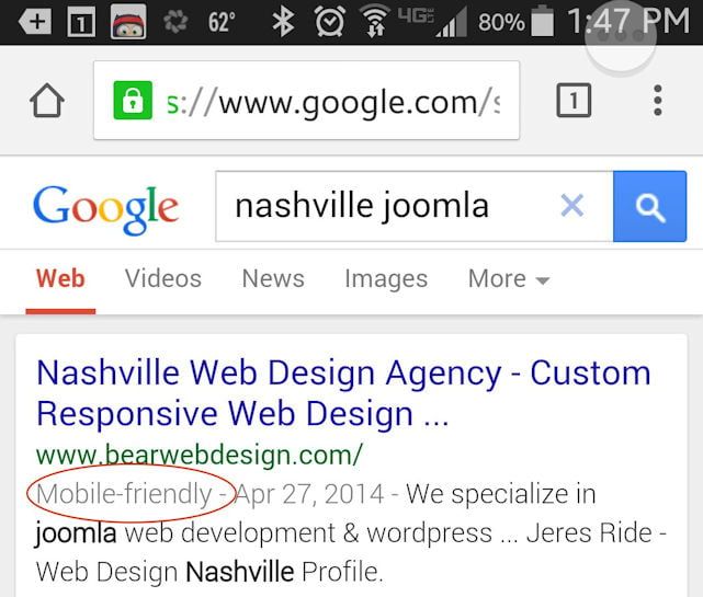
Google Introducing “Mobile-Friendly” Tag Search Results

While sitting in line last month to get my annual auto emission test I was searching on my mobile when I noticed a tag in results “Mobile-Friendly”.  I had never seen it before and recognized immediately what it meant – “Google is telling mobile users what sites are going to be a good experience to visit on your mobile”.  Google’s Search Engine’s aim is to lead you to the best search results but it is now drawing a line in the sand and basically saying if your website is not mobile friendly (no matter how much wonderful content you have on that site) – it is not going to get the all important “Mobile-Friendly” tag.  This tag in my opinion will help users decide whether they actually visit your website. And long term I suspect google may even consider listing Mobile-Friendly results first.

Once I spotted this I started watching out for an announcement from Google. Google is constantly changing and testing new products and I wanted to wait until an official announcement came out before sharing with customers and associates. Sure enough this week Google has made that announcement that they will be rolling this out over the next few weeks.

So what does mobile-friendly search tag ultimately do for your website?

If you do have a mobile-friendly site (responsive website) – well Congrats and Well Done! You not only are making it inviting for your customers to use your website on a mobile device – Google is going to bring your more prospect traffic with the Mobile-Friendly Search Tag. Your choice to head in this direction in the last 12-24 months looks like it will really pay dividends in the upcoming year!

If you DO NOT have a mobile friendly (responsive website) you will most likely start getting less and less mobile traffic (which in essence will also have a bearing on your regular search results as google uses visitation as key ranking parameter).  Loosing traffic generally means less prospects more than anything else but keep in mind you also are wasting your customers time (and causing frustration) when they have to use a non-mobile friendly website.

Is it too late to upgrade to a mobile-friendly website?

I don’t know the actual stats on the internet (which sites are mobile and which are not) – but my suspicion is less than 25% are mobile-friendly right now. Which means some of your competitors haven’t taken that leap yet. I was recently reading a news site on my mobile and saw a great ad for a famous beach town in South Carolina. I clicked on the ad and to my dismay landed on a non mobile-friendly site and simply closed the site. I have since see the ad 100’s of times but never bothered to click it again. I couldn’t believe a tourist bureau would actually invest in online advertising sending you a non mobile-friendly page and expect to have great results – but it shows that lots of companies and organizations have not fully grasped the importance of a mobile-friendly (responsive site).

If you want to verify that google is seeing your website as mobile-friendly please visit Google’s Mobile Friendly Tool. On this page Google really clarifies the biggest issue with websites are not mobile friendly – Readability & Navigation.

Be sure to make upgrading to a mobile-friendly (responsive) website at the top of your marketing plans for 2015 and be sure to contact us at Bear Web Design if you need some help!

Responsive Design

We do our best to help you  “Go Responsive … Responsibly.” When we design a Responsive Website at Bear Web Design we focus on what a mobile, tablet or desktop visitor is wanting to accomplish.  Working with our clients we try to create a user experience that is optimal in varying device sizes. Check out this article from Website Magazine:

Some Key Quotes from Article: 

What’s more, because viewing websites on mobile devices is generally quite slow, most people are reluctant to start tapping all over a page. This means that design must make it visually clear what elements on the site allow for user interactions. Buttons, links, form fields and other points of user interaction must be large enough to be clicked easily, and spaced far enough away from other page elements that users don’t risk clicking the wrong elements. – See more at: http://www.websitemagazine.com/content/blogs/posts/pages/responding-to-the-hype-of-responsive-design.aspx?utm_source=newsletter&utm_medium=email&utm_campaign=newsletter#sthash.fiNiJ9zw.fS5Q6Zwx.dpuf

“… viewing websites on mobile devices is generally quite slow, most people are reluctant to start tapping all over a page. This means that design must make it visually clear what elements on the site allow for user interactions. Buttons, links, form fields and other points of user interaction must be large enough to be clicked easily, and spaced far enough away from other page elements that users don’t risk clicking the wrong elements.”

“A safer approach for many sites will be to use a drop-down or “select” menu. The user simply clicks the menu and scrolls to the selection (or category) of interest.”

Banking Just Got Simpler with CedarStone Bank’s New Responsive Website

Over the last few months, CedarStone Bank has been working on a new responsive designed website. A responsive website is a website that is mobile, tablet, laptop and desktop friendly and provides an optimum user experience based on the device with which the website is being used.

With the significant increase in mobile and tablet usage over the last 12 months, the need to provide easy website usage (not just access) has never been greater, and CedarStone Bank’s new responsive website site provides a great experience for all website visitors.

The website was custom designed and developed by local company Bear Web Design under the direction of John B. Bryan, CedarStone Vice President, Business Development Officer and Tina Winfree, CedarStone Senior Vice President and Operations Manager.

“The entire CedarStone Bank team is excited about the launching of our new and improved website. CedarStonebank.com is easier to navigate while offering the latest and greatest online banking applications. The responsive design makes it attractive and manageable from most any mobile, laptop or tablet device,” commented Bryan.

“The website project was a product of our bank’s ABC program. In July of 2012 we started a program designed to train and mentor CedarStone Bank employees in becoming aspiring bankers. The Aspiring Bankers of CedarStone (ABC) program was designed to educate, enlighten and develop employees to be well-rounded banking professionals as well as to empower them to make our bank better,” he added.

Incorporating the corporate brand and colors of CedarStone Bank with an exciting array of images and data display widgets, the CedarStone Bank website comes to life with a prominent slideshow and rich content, friendly navigation, and a direct and easy login to mobile banking. A new feature of the website is CedarStone Bank News and Blog, which integrates and publishes directly to social media, keeping customers connected with the latest website news and information in their favorite social media.

We Are Responsive!

Desktop Laptop Responsive Website CedarStone Bank

Laptop and Desktop view gives visitors the full experience, with easy to use navigation and lots of key information accessible from the home page. You can find a branch location easily and our contact forms integrate with Google Maps, allowing you to even get driving directions while staying on the website!

Tablet and Mobile Responsive Website - CedarStone Bank

Mobile & Tablet views will really show you the advantages of responsive design. While launching a great image-based website is becoming the vogue (with large image backgrounds and slideshows becoming more common), the fact is, if that site isn’t easily accessible in a mobile or tablet experience, then a larger and larger user segment base is being overlooked and ignored.

ALWAYS SECURE – security remains CedarStone Bank’s top priority, with the highest standards of website security and protocols being implemented.

SO, like never before, Banking Just Got Simpler with CedarStone Bank’s New Responsive Website.

We look forward to seeing you online and at a CedarStone Bank branch soon!

Bear Web Design launches Responsive Wilson County Fair Website

Over the last few months, Bear Web Design has been working on a new responsive designed website to launch for the 2013 Wilson County Fair. A responsive website is a website that is mobile, tablet, laptop and desktop friendly and provides an optimum user experience based on the device with which the website is being used.

With fair goers using many different devices to access event information — ranging from family planning on a laptop or desktop, to mobile and tablet users checking out their favorite events as they head down I-40 to Lebanon, TN to the Wilson County Fair — the new responsive website site provides a great experience for all website visitors.

The website was custom designed by our awesome design Team Vicki Beare and Dana Bryson under the direction of Helen McPeak, Nell Stephens & George Wallace. As always with Vicki and Dana, their designs are visually amazing while maintaining excellent functionality. Incorporating an exciting array of image and data display widgets, the Wilson County Fair site comes to life with eye catching graphics and logos, and with great photos from the Fair’s photography team.

Matched with great design is the tremendous content work by Nell Stephens, who manages all content on the website. There are close to 500 event listings for this year’s Fair, and to ensure each event is accurate as well as informative is something Nell has mastered.

To appreciate the full experience I invite you to visit the website on at least 3 devices (mobile, tablet, laptop or desktop) to get a full appreciation for responsive design which is where all of Bear Web Design’s new development efforts have been focused in 2013 – http://www.wilsoncountyfair.net

Laptop and Desktop views will really give visitors the visual experience of being at the Wilson County Fair. As you enter the site you will see a great background photo (which changes daily and really sets the experience for the website visit). Our photo slideshow can quickly take you through several great photos that link to a specific event (or event category) or to any general article in the site.

Of course, the star of the website is the list of events, which are being presented through our new event system which can be accessed via the main menu. For the first time on the Fair website, we are capable of tying event listings to the actual events photograph. We are currently loading event photos for specific events providing you with the capability of reading event details and seeing some great event photos. Another great feature this year is Facebook comments that allow the visitor to post a comment about any event (that is not only shared on the site but also shared in Facebook).

Other key elements include:

  • Sliding icon based navigation system (key fair items such as contacts, vendors, directions, tickets etc.
  • Tab based info (In the right module) that can be clicked on to expand information (click on videos to see the Wilson County Fair video channel)
  • Blogs and News (that automatically update Social Media — Facebook, Twitter, Google+)
  • Digital advertising, with ads designed to effectively promote the Fair’s sponsors and advertisers while fitting aesthetically into the look and feel of the new website.
  • A twitter feed gives the fair a direct broadcast banner which will be used to provide key information updates throughout the Fair.
  • Sponsorship Scroller on the home page, providing great visibility and recognition of Fair sponsors.

Wilson County Fair Responsive Site on iPadMobile & Tablet views will really show you the advantages of responsive design. While launching a great image based website is becoming the vogue (with large image backgrounds and slideshows becoming more common), the fact is, if that site isn’t easily accessible in a mobile or tablet experience, then a larger and larger user segment base is being overlooked and ignored.

The Wilson County Fair’s mobile site provides key drop down menus as well as immediate search options. The key to a good mobile site is navigation, so these items are directly below the new fair logo.

wilson-county-fair-ipad-verticalThe logo and new slideshow are sized to 100% of the mobile device (and tablet when in vertical view) – and you can easily review the great slideshow you see on the desktop with touch-screen navigation to scroll to the next photo.

Touch navigation is relevant in both Mobile and Tablet,  and the behavior of finger touch screens are tested thoroughly by Vicki and Dana (using a variety of iOS, Windows, and Android devices and browsers) to ensure they are easily navigable.

Additionally, the mobile and tablet views are complemented by fully readable events, blogs & articles with access to photos, videos and key information. We even have our sponsors ads running on the mobile sites in 2013 as we are expecting a surge in mobile use this year with up to 25,000 unique visitors.

One important thing to keep in mind is that all of the responsive views use the same data and info as the full desktop site  — so there is only one site to maintain and update. (This is a huge and relatively recent improvement over the days when a mobile site had to be updated separately.)

Introducing the Wilson County Fair’s First Mobile App!

To cap off the new Wilson County Responsive Website we are introducing our first Mobile App (Event App) that is browser based.

This means you don’t have download the app to use it, and it does not require a different download for different operating systems (e.g. i-Phone, Android, Blackberry).

The mobile app comes with a sharp and crisp interface giving you a different look than the actual website event listing and these events are tied to Google Map and  GPS coordinates identifying precisely where the event is taking place in the Fair Grounds.

Wilson County Fair Responsive Site on iPhoneUltimately we are working with this app to have the ability to navigate around the fair with your mobile device while being constantly aware of what events are up and coming. We will be sharing more information on our new mobile app as we progress through its setup.

So like never before you can stay tuned, connected and engaged with the Wilson County Fair.

We look forward to seeing you online and at the Wilson County Fair – August 16-24, 2013!
What is Responsive Website Design?

What is Responsive Website Design?

2013 has been declared the year of Responsive Design in many web circles. If you haven’t heard of  Responsive Design yet, you will soon. The reason it was created (and is snowballing in popularity) is because of the need to optimize websites on different devices — mobile, tablet,  laptop & desktop — with the growth of the mobile and tablet markets being the driving force for Responsive Design. 

In the last 12-24 months at Bear Web Design we have seen a significant increase in customers requiring their sites to be mobile friendly.  In the last few years mobile strategies have ranged from building completely separate standing mobile sites (which have been expensive to develop and quite often require double web content entry) to adding multiple separate templates to a website which would detect the device and execute the appropriate template.

Similar challenges have also emerged with the tablet market.  When you add the various browsers and operating systems into the mix of devices you can easily see the challenges that are facing websites today (and Web Designers and Developers).

Introducing Responsive Website Design!

Responsive web design is a web design approach aimed at creating sites to provide an optimal viewing experience—easy reading and navigation with a minimum of resizing, panning, and scrolling—across a wide range of devices (from desktop computer monitors to mobile phones).  Basically your website responds to the device and browser to give an optimal user experience.

Generally speaking these Responsive templates are built from the mobile level up (complete opposite of creating a mobile site from an existing full size website).  The template is then customized as needed to suit each device with image and content sizing and various element display.  The key is that all images, content, forms, buttons and other elements fit attractively (and usably!) into the device viewing the website.

Bear Web Design Commences Responsive Website Design

We have commenced designing and developing our custom templates using Responsive Design in late 2012 and we have our first client sites coming online in this quarter.  We will be sharing these sites with you and highlighting the sites on each device so that you can develop and increase your knowledge in this area. 

We are also very excited be able to offer Responsive Designs upgrades to our existing client base (which includes upgrading from Joomla 1.5 to Joomla 2.5 as part of that process). There will be cost and time involved in these upgrades and we will be sharing the process with our clients. But the rewards will be immense, as there is no doubt that websites which are not mobile and tablet friendly are going to lose a large segment of prospects and customers in the upcoming years!

Be sure to watch out for our Responsive Design blogs from our Design and Development team over the next few months.

Talk to us today about Responsive Website Design!

If you wish to find out what’s involved in making your website responsive shoot me an e-mail (or call me at 615 504 6845) to discuss!

Cheers,

Peter